Establishing pay equity around the world through radical simplicity

Overview
Gapsquare’s mission is to establish pay equity around the world.
Gapsquare work to ensure that people are paid fairly for the value they provide – no matter their gender, race, age, or identity.
Gapsquare provides accessible tools to help companies not only identify pay disparities and foster lasting pay equality, but to also arm them with the critical information needed to plan for a fair future of work.
Unfold have partnered with Gapsquare for over 3 years as specialist UX consultants, advising the Gapsquare product team on how to make their pay analytics software easier for people to understand.
Challenges
- Taking a complicated, legacy product through a huge transformation to eliminate confusion and bring value to users.
- Creating a self-serve solution, ending the need for a consultant to help customers understand how to use the pay analytics software. Empowering customers so they have the confidence to use the software independently.
- Implement the principle of ‘elegant simplicity’, whereby we package the complexity of the system inside of a design which allows it to be easily understood. Simple does not mean simplistic!
Outcomes
- A push towards radical simplicity, with a more interactive and connected view of the data.
- Prioritising user actions, reworking and streamlining flows.
- Better communicating what the impact users’ choices will have upfront.
- Clarifying and bringing consistency to terminology across the app.
Working in partnership
As part of our partnership with Gapsquare we participated in a series of workshops with the product and technical teams to broaden thinking and generate ideas. A key theme to come out of our workshops was this idea of ‘radical simplicity’.
The main principles established were as follows:
- Elegance over simplicity.
- Empowering customers in a way that allows them to use the software without the need for a consultant.
- Design intuitive complex systems.
- No fuss, no clutter!
- Remove any manual interventions.
Armed with this information our team was able to confidently collaborate with the Gapsquare design team across different areas of the application.

Ideation workshops A key theme to come out of our workshops was this idea of ‘radical simplicity’. We needed to package the complexity of the system inside of a design which allows it to be easily understood.
FairPay Planner
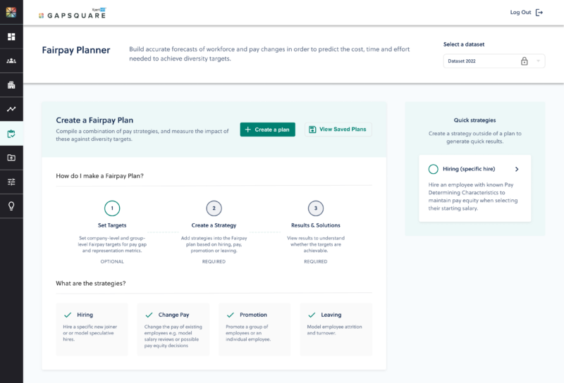
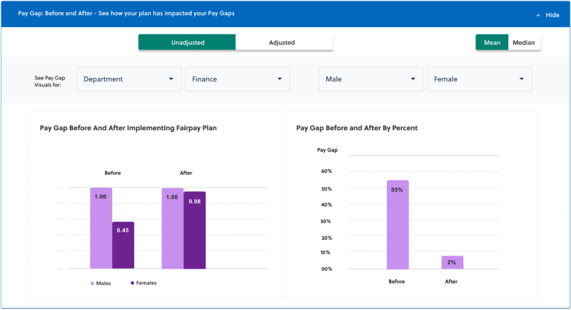
One of the most important parts of the Gapsquare app is the FairPay planner. The planner is a tool which allows HR leaders to build accurate forecasts of workforce and pay changes in order to predict the cost, time and effort needed to achieve diversity targets.
Using the tool, leaders can quickly and easily model the effects of different pay strategies, allowing them to make more informed decisions about pay and ultimately promote a more equitable compensation policy in their organisation.
Unfold worked with Gapsquare to design several iterations of the planner. At each stage the designs were tested with real users of the platform to ensure it provided their customers with the tools they need to model changes quickly, easily and in a way that reflects their actual business.
“Unfold has been a brilliant digital partner to Gapsquare. What particularly stands out is their high level of communication and commitment to providing an excellent UX. They also work in a very lean fashion, which means we can iterate on the platform faster and more effectively.”
Siân Webb, Group Product Manager at XpertHR

Charts
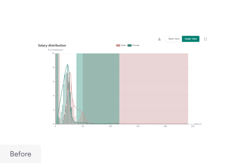
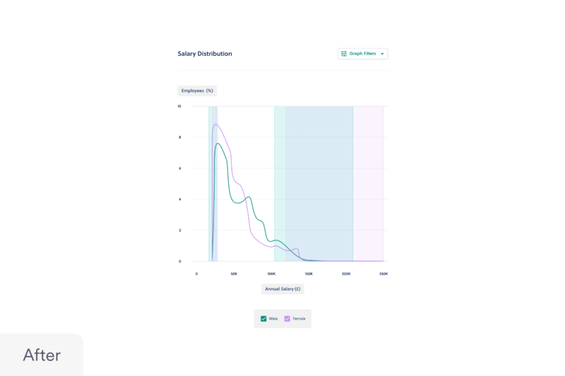
Another of the core pillars of Gapsquare’s software is how it visualises data to help users draw insight. We worked with them to bring clarity and consistency to the charts used throughout the app.
Our design team produced a set of guidelines, including rules around colour use, label placement, layout, type hierarchy and alert messages.
Following this, we went through Gapsquare’s key charts and redesigned them according to the new guidelines. A key consideration here was designing for the fringe cases, for example instances of very long labels and very large numbers of data points. Another key area was user control and providing different ways to view the data, for example checkbox legends and adding toggling to table views.
Filtering & controls
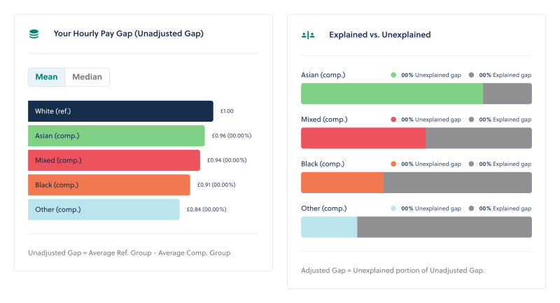
Another area that required UX attention was the on site filtering system. Our team worked on improving filters, initially guiding users into the data using familiar language and distinct pathways, giving customers the control to be able to extract the information they want.
We then created filters that indicate the impact of the choices before the customer makes them, in order for them to understand what it is that they’re taking and controlling.
This project represents just a glimpse of the work we’ve delivered for Gapsquare throughout our 3-year partnership. Our collaboration has, and will continue to focus on ongoing improvements, iterative processes, and site optimisations. We look forward to continuing our work with the Gapsquare team to further grow and progress their site in the future.
 Izzy
Izzy
 Harry
Harry
 Ashley
 Tom
Tom
