Article
How to supercharge your online sales | Product page conversion optimisation

A product page or Product Detail Page (PDP) is one of the single most important steps in your users’ journey. This is the place where customers get to explore and understand your product in more detail and make that all important “add to cart” step towards converting into a sale. The choices you make designing this page will have a huge impact on the success of your business.
Before we dive into ways to improve your PDP, it’s important to first consider what metrics we’ll use to measure the success of any changes. Two of the most important metrics are: Bounce Rate and Add to Cart (ATC) Ratio. These will help you to understand some vital insights: firstly, Bounce Rate will show you the percentage of visitors who enter the page and then leave straight away. It is therefore a good metric for seeing how effective your page/product is at capturing and holding your audience’s attention. The ATC ratio then shows the percentage of visitors who place at least one item in their cart during the session. This is considered a good indication of potential to purchase and is therefore vital to track and measure when looking at the design of your product pages.
With that in mind, here are our top 10 tips for improving them by making some changes to your product pages:
1. Remove barriers to decision making
It’s obvious that you’ll want to bring down as many barriers to conversion as you can. Before you can do this, however, you’ll need to get in the minds of your customers and find out what they need at this stage in the buyer journey. To achieve this, we would always recommend user testing. The aim of this is to both find out what your users’ needs and interests are, but also to find out exactly where they’re getting stuck on the journey at present.
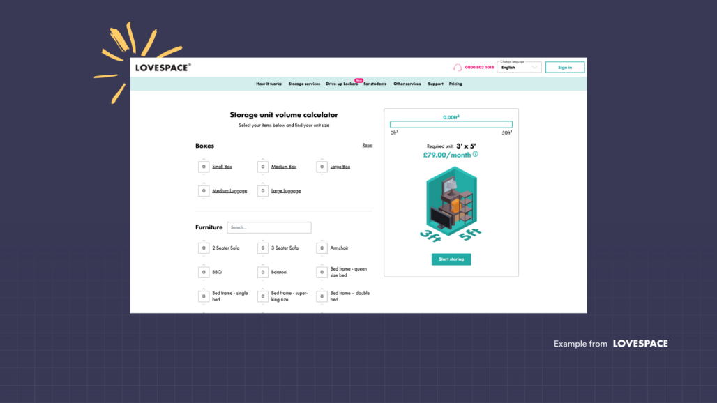
For example, in the self-storage industry, a common barrier to conversions is that customers find it very difficult to visualise how much storage space they will need for all their belongings, especially when buying online. To help remove this barrier for conversion, for one of our clients we created a calculator to help customers estimate how much space they would need based on the items they wanted to store.
Seeking out opportunities like this to remove confusion in customers minds will help you improve that all important ATC rate!
2. Customer generated content
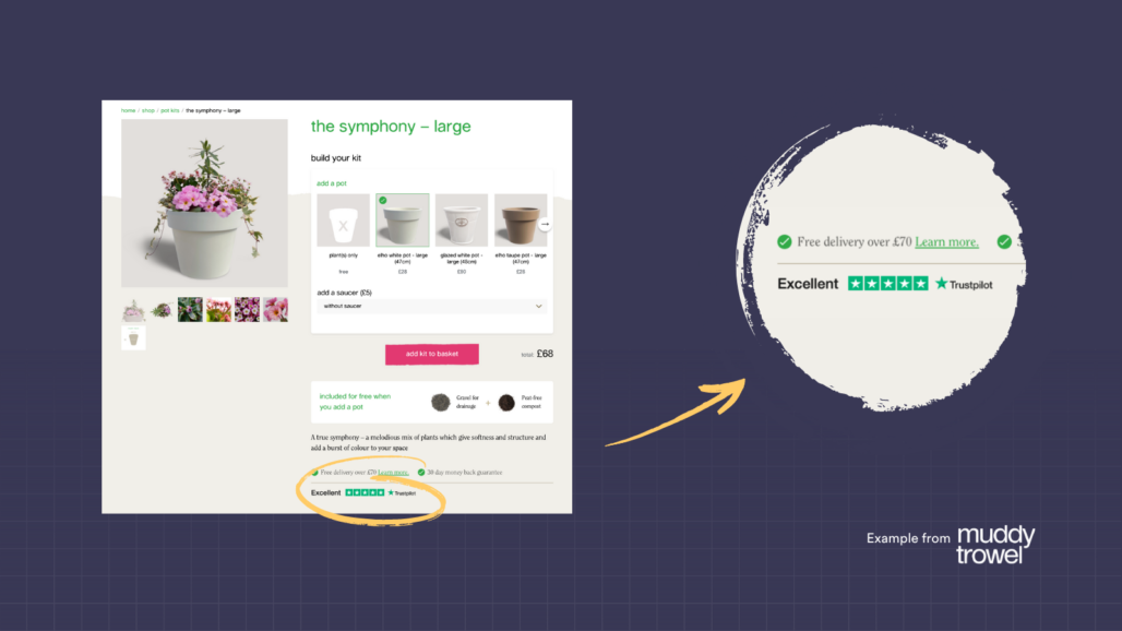
It’s tried and tested advice, but the importance of genuine customer reviews and testimonials cannot be overstated. Embedding services like TrustPilot in your product pages will give customers social proof that you can deliver on your brand promise, people think your products are great and that you’re a trustworthy business.
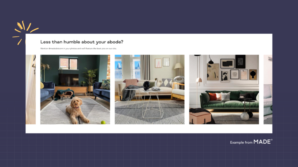
If you’re in B2C, you can take social proofing a step further by encouraging user generated content like sharing a feed of customer instagram photos of your products in their own homes. MADE.com does a great job of this with a section titled “Less than humble about your abode?”. This section is on each of their product pages and shows off MADE customers’ photos – this is great for inspiration/social proof but also has the additional benefit of engaging with their existing customer base as well.
3. Good imagery for every product combination
It’s true what they say, people buy with their eyes; so good imagery on your online store is a given. But customers these days expect more, and if you really want to maximise your ATC rate, then you’ll need to have good imagery for every product variation.
For example, if you sell a particular t-shirt that is available in 10 different colours; you need to have images of that t-shirt available in every colour you sell so that customers can visualise what they’re getting.
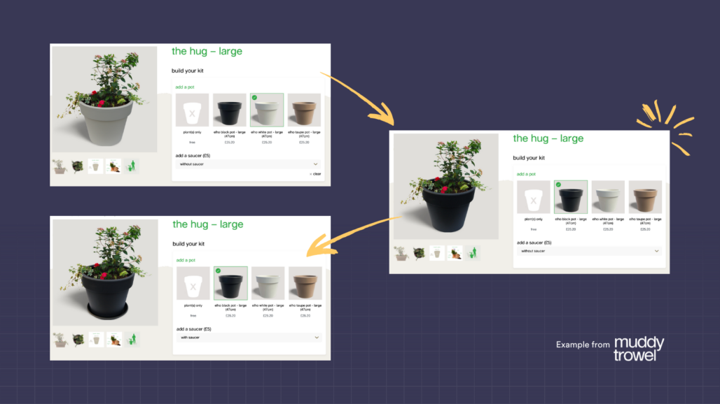
With some products, you may have even more complex variations of your product available. One of our gardening clients, for example, has flower kits with multiple variations of the plants and pot combinations available in each product (with as many as 30 individual SKUs per product page). We’ve gone out of our way to develop a system which quickly and easily allows the customer to build up their kit and see a composite photo of the product combination they’ve selected, helping them to make a purchase decision.
4. Give all the info but don’t overwhelm
This is a delicate balance; whilst you want to be transparent in your product pages and make sure you’re answering your customer’s questions, it’s important not to share everything at once. Putting too much information all at once will overwhelm customers and paralyse decision making. This in turn is likely to create high bounce rates.
You need to get people excited first and hook their interest before slowly introducing more detail; this is called “progressive disclosure”. For our client Muddy Trowel’s product pages, you can see that we’ve kept the most important information near the top and kept more detailed information relevant to deeper purchase consideration further down the page.
5. Feature common product FAQs
Including common questions you’ve received, or you anticipate you might receive, not only helps to reduce the time you spend replying to emails but removes further barriers to conversion. These shouldn’t take up heaps of space and are often best included in a drop-down heading, especially if you have lots of questions to answer.
6. Craft thoughtful product descriptions
It’s important when writing copy to be specific and descriptive about what people are getting. At the same time though, don’t forget to convey some emotion and inspire people with your words. Crafting great copy will paint your products in the best possible light by focusing on the benefits and value of the product to customers.
7. Make your Call To Actions (CTAs) obvious
You wouldn’t believe how common it is for this to be overlooked. Make sure people can see how to add things to their basket; make the button constantly available and make it a vibrant colour to make sure people don’t miss it. Believe it or not, we changed the “add to cart” CTA on one of our clients’ websites from green to pink and it made a notable increase in conversions through A/B testing.
8. Provide relevant up-sells and cross-sells
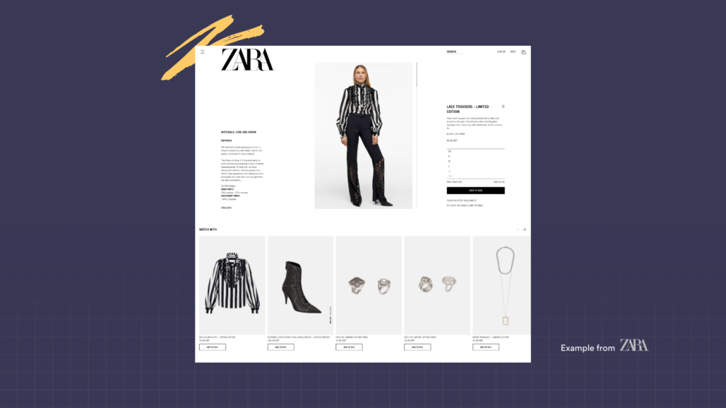
Up-selling is when you attempt to encourage a customer to make a higher value purchase, cross-selling is encouraging purchases of related or complimentary products. We recently conducted some customer research on providing recommended products and interestingly, people really valued up-sells and cross-sells when they were relevant and targeted to the individual. However, we also found the converse was true – if the recommendations were poor or irrelevant then it impacted negatively on their perception of the brand. You can see Zara do this to great effect below, suggesting items which are on the model in the product image – useful to those seeking outfit inspiration for the item they’re about to purchase.
9. Highlight scarcity
Adding some urgency is a proven tactic to reduce purchase consideration time and get conversions over the line. This can be something as simple as showing when an item is low in stock.
Another tactic an increasing number of online retailers are implementing is showing the number of people who are viewing the item right now and/or the number of times it was bought in the past 24 hours.
John Lewis utilise this tactic on their product pages:
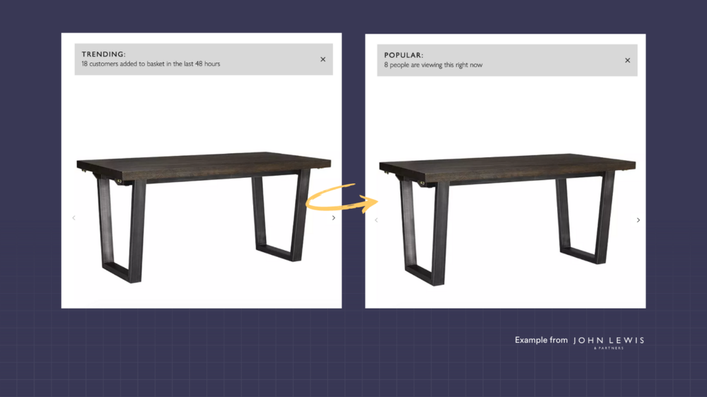
It’s important that these tactics don’t come across as pushy, or overly invasive, but we think John Lewis gets this balance spot on.
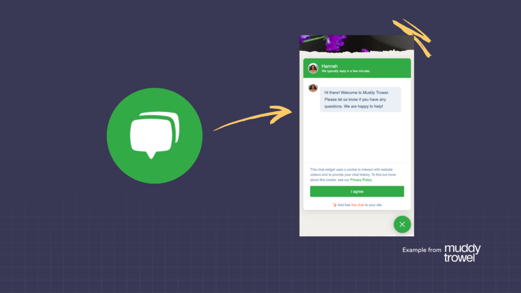
10. Have a live chat facility available
These can be operationally a bit tricky and resource intensive to provide, but for an eCommerce store it’s a huge conversion tool. Having an expert CX team member always on hand to sooth customer concerns at the point of purchase will help to provide an additional layer of service to customers that will be reflected in your sales.
Talk to us about how you can optimise and improve your website or develop your web app!