Resources & guides
Featured
Article
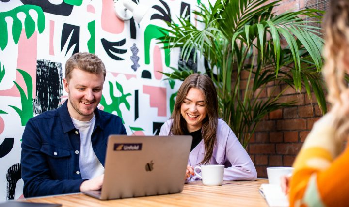
AI and why the case for designers has never been greater
There’s a lot of noise about AI at the moment, and not much of…
Article
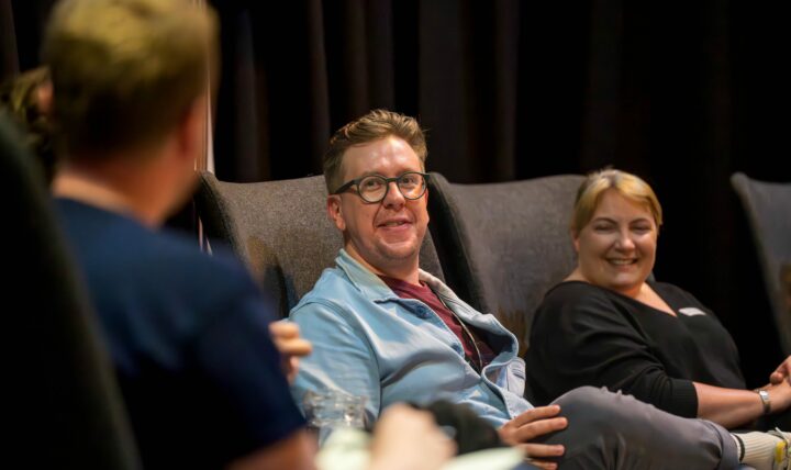
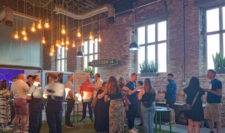
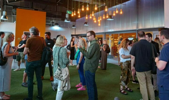
Marketing magic: prioritising marketing efforts for maximum ROI
Another success for Smart Cookies with an amazing evening full of marketing magic! It…

Article
Travel and tourism: 8 strategies for improving your website
Article
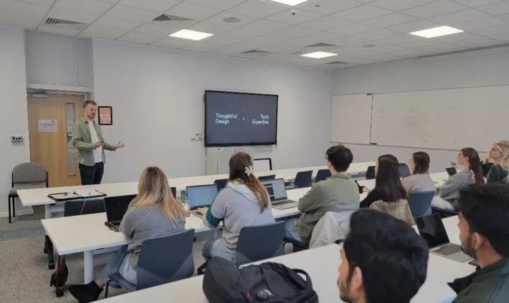
People & culture: Strategies for leading thriving teams
Article
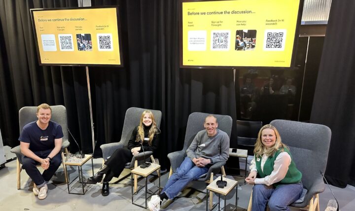
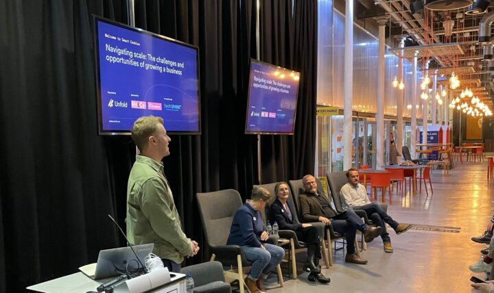
Navigating Scale: The challenges & opportunities of growing a business
Article
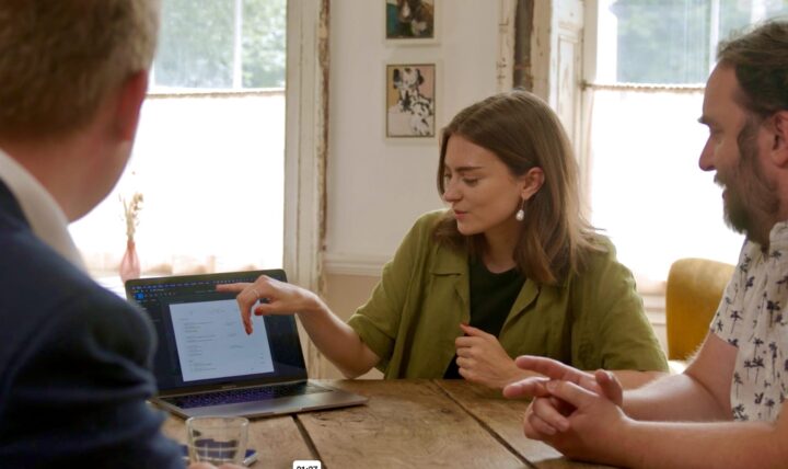
Building inclusivity into your product design process
All resources
Article
AI and why the case for designers has never been greater

Article
UX for adventure travel: Design that converts
Article
Closing the gap: Aligning sales and marketing for better results
Article
Travel and tourism: 8 strategies for improving your website
Article
People & culture: Strategies for leading thriving teams
Article
Insights to Impact: Why the UX design process is a vital tool for marketers
Article
Inside Investment: What they don’t tell you about raising money
Article
Tech for Good: Building Businesses for Positive Change
Article
Tech for all: Inclusion in innovation
Article
The human element: the key to designing great digital experiences
Article
Navigating Scale: The challenges & opportunities of growing a business
Article