
What is the MVP approach and why use it?
The MVP methodology refers to the process of building a web app or digital platform into a Minimum Viable Product (MVP) in the first instance, with the intention of building iteratively on this foundation from thereon. This method emphasises the importance of learning and only building features you’re sure are necessary.
Not only does this mean your project can be launched super quickly, but it also creates far less wasted time and resources building features which don’t work for users and don’t promote conversions.
What does it involve?
This process involves an iterative build process. Rather than building a website or app in one large, feature-rich release (which could take months/years to produce), we instead:
- Refine the idea and conduct user research quickly, using real customer insight.
- Design wireframes and build out the design to a low or no-code prototype, to test the proposition cheaply
- Conduct more user research on the basis of the prototype, which will give you information on what features are needed in the first fully built MVP version and which don’t work.
- Create a website or platform which provides only the highest value features as decided on by the eventual users of the product.
In this article we’re covering the next steps, and how to develop your MVP post launch.
What are the benefits of working this way?
Far less time and money wasted building the wrong thing
This is one of the number one benefit. The build phase of website development can be some of the most time consuming and expensive, so why would you want to spend it building features you don’t even know will work? This model allows you to test with your users first to find out what they really want, and build on the basis of your findings.
Users find the site easier to use, driving higher conversions
Because the build is designed based on user insight, the end result will also be far more user friendly and as a result drives higher conversions.
So how do you progress after the initial MVP build?
What does an iterative build look like and what process do we have to go through to make choices on new features? Obviously this will look different depending on what you’re trying to build, but the main principles remain the same.
The build phase of website development can be some of the most time consuming and expensive, so why would you want to spend it building features you don’t even know will work?
The process:
User testing
Once you’ve gone through the initial prototyping process, you’ll want to make sure user testing is your number one priority. If you’re working with an agency, user testing will usually be done collaboratively between the client and the agency.
Testing methods might include:
- 1-1 discovery calls,
- focus groups,
- Page A/B testing (using Google Optimize),
- Session recordings (Hotjar),
- Data led bottleneck discovery using Google Analytics, Google Data Studio and a KPI dashboard (more on KPI setting in a minute)
You’ll also want to set up a Net Promoter Score (NPS) survey. This is a market research metric ranging from -100 > 100, based off of a single survey, which asks participants to rate the likelihood that they would recommend a company, product or service. Participants from this will be classed as “Detractors”, “Passives” or “Promoters”
Net Promoter Score = % of promoters – % detractor customers
KPI setting
Something of key importance is to have clear KPIs set to benchmark your progress against. It’s also essentially important that these are the right KPIs which will provide valuable insights into conversion rates and possible impacting influences. Don’t just monitor vanity metrics.
Once you have your user testing data capture set up, you can look at how to implement changes from what you’ve learned.
To help explain, we thought it would be easiest to highlight one of our very own clients, Muddy Trowel, who are the perfect example of launching to MVP and user-focused, iterative long term development.
A bit of background…
If you’ve been following our channels for a while, you might have already heard us wax lyrical about Muddy Trowel. For those of you who don’t know their story already, Muddy Trowel were born at the very beginning of lockdown in 2020. The business’ founder, Steve Folwell realised a gap in the market where garden centre closure had meant that plant stock was stuck in the supply chain and at risk of going bad. Additionally, keen gardeners stuck at home weren’t able to get access to the stock they needed for the upcoming Spring season.
Muddy Trowel was delivered from initial idea to an MVP launch in just 2 weeks, with help from the Unfold team. This isn’t something we’d normally do so quickly, but given the necessity being driven by the market conditions we pulled together and executed as quickly as possible – which just goes to show how quickly the MVP development model can produce results when needed! The results spoke for themselves, with Muddy Trowel racking up 100 customers just 30 days after lunch.
Why do we take this approach?
When it comes to complex builds (like eCommerce sites, booking platforms, SaaS or job management platforms as a few examples), attempting to build all the features in one go will mean you’re left with far too much to consider upfront. You could end up feeling a bit paralysed which can slow you down significantly, and the slower you are to launch the longer you go without learning from your users and understanding customer behaviour.
Particularly if you’re going for a new market, it’s so important to learn about your customers first. Greater confidence over the customers and products offers more scope to plan for a custom technology which actually helps to address customer issues. In the case of Muddy Trowel, there was no point in creating this tech until we knew what customers needed, and we certainly didn’t want to start building things if we didn’t know they were going to work or users would want them.
Step 1.
The first version of the website was extremely stripped down and basic, nothing was custom, we just built the bear bones and released it. People still bought from it though, so this proved to us that if the website was good, we could probably sell a lot more.
It was only after we’d proven that there was customer demand in this way that we sat down and got a better idea of what we needed to build.
Step 2.
Next we had to find features that customers actually wanted, would help their journey and would drive conversions/increase basket size. So we introduced new features and functionality such as gift cards, basket reminders as well as installing things like Google optimize for A/B testing which offered a wealth of new data to learn from.
Step 3.
From here we continued optimising on the basis of the KPIs we’d set. After a year in the market we’d probably redesigned the entire website at least once, some of the pages being redesigned 3 or 4 times on the basis of the testing we’ve done.
The changes in practice
We’ll use two examples to discuss the changes we made and why we made them; the shop page and the individual product pages.
Every change we made was led by data to address bottlenecks in the funnel.
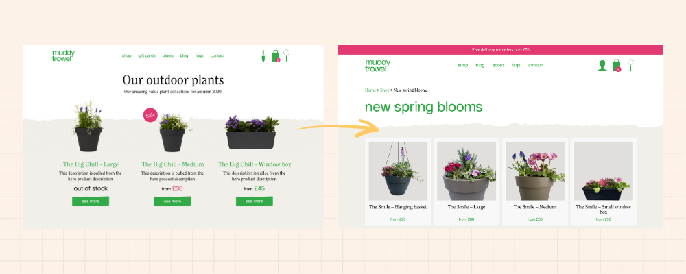
The Shop page;
Here’s a comparison snapshot of how the Shop page looked to begin with compared to how it looks now.
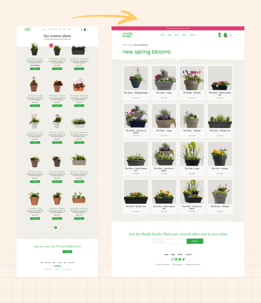
As you can see, the initial shop page just listed all the products that were available. There were descriptions included but these weren’t very helpful and it was difficult to get a feel for the plants and flowers from the pictures. From an IA point of view, it was also difficult for users to find what they were looking for, as there were no categories for selection or filtering, so we found that items at the top of the page sold better than those at the bottom, despite those at the bottom potentially being better.
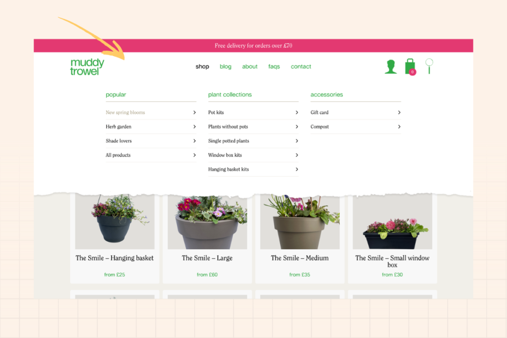
To resolve this, we split the shop page into categories to help people navigate through the entire range. We also have options for additional categories to be added in seasonally, or for certain occasions such as Mothers Day or for specific functionalities such as potted plants, window planters and hanging baskets. So now if users click on the Shop menu, the drop-down appears offering categories for each of these shopper intentions, making the user journey much easier.
Product pages
This is where some of the biggest changes were made.
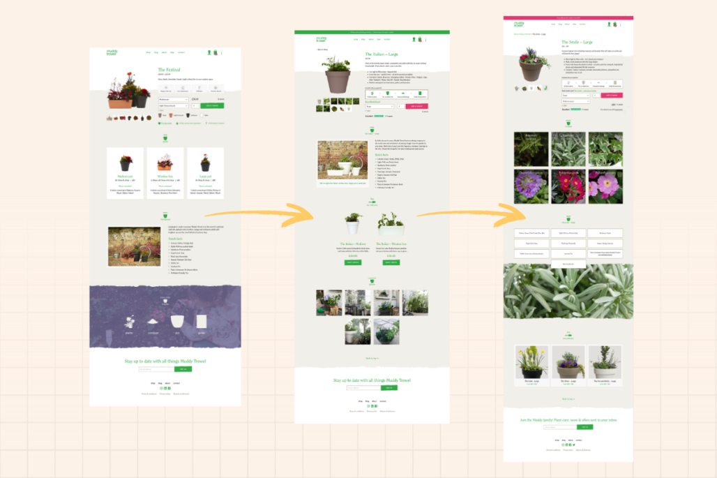
One of the initial key issues was a struggle to get people to add stuff to the basket. What we found from user testing and interviews, was that people were confused about the product offering on the page.
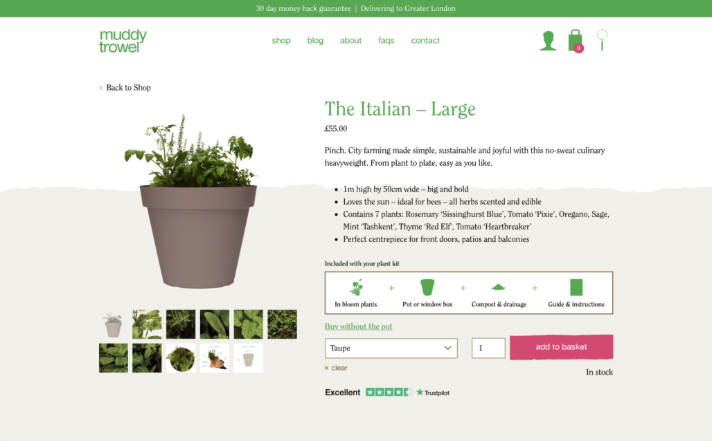
Version 1
Above is a closer look at the first version of our product pages. The idea was that we would have a collection which was available in different sizes and we thought that by having these on the same page you could choose the products and pick the colour you wanted. As it turned out this was actually confusing, users didn’t know what plant or product they were getting and it didn’t make sense to them.
It also made the product info quite hard to structure and we couldn’t add anything of much use because it had to apply to all of the products. It was also difficult to give info on what plants were included in each option and the info we did provide didn’t come across easily enough for people.
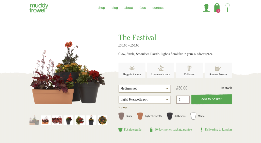
Version 2
So we ended up taking all the products and splitting them out into separate product pages as you can see above. This made things much easier and the descriptions also became much more relevant.
If you wanted to see the different options within a collection, you could scroll down to see these a little further below.
And here’s where we are today!
Version 3
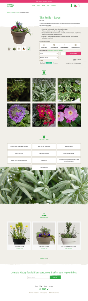
The big learner from one to another is that people want images and visuals. So now, people can see close-ups of exactly what they’re getting in their pots, which was found to be of key importance during focus groups. So we now have a plant directory with lots of bright eye-catching imagery, easily showing what the product will look like in full bloom.
You can also see another section further down if you wanted to branch out to a different size/format.
After adding the top banner highlighting the 30 day money back guarantee, A/B testing told us that more people saw this when it was in pink compared to when it was in green.
So there is a big transformation here from a very text heavy page to something which looks and operates much better. From this we can see things gradually improving over the past 12 months.
If you’d like to develop your platform with us, get in touch!